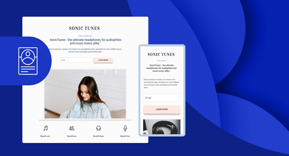
In the digital age, where attention spans are shorter than ever, crafting an incredible landing page is essential for capturing the interest of your audience and achieving your conversion goals. Whether you’re aiming to boost sales, collect leads, or simply provide valuable information, your landing page can make or break your online success. To help you create landing pages that truly stand out, let’s explore some incredible examples that can motivate and inspire your own.
Airbnb’s landing pages are a prime example of how personalization can enhance the user experience. When you visit Airbnb’s website, the conversion page doesn’t overwhelm you with information about every possible destination. Instead, it asks for your location, travel dates, and the number of guests, instantly tailoring the content to your specific needs. This approach minimizes friction and guides visitors toward their ideal accommodations, making for a seamless user journey.
Takeaway: Use personalization to make your visitors feel seen and understood, increasing the likelihood of conversion.
Slack, the popular team communication tool, keeps its conversion page straightforward. The headline and subheadline communicate thrm’s value proposition: “Where work happens.” They also feature a clean, uncluttered design with minimal distractions. The call-to-action (CTA) buttons are strategically placed and use action-oriented text, making it easy for visitors to start using Slack right away.
Takeaway: Craft concise and compelling messaging that highlights your product or service’s unique selling points.
Dropbox leverages benefit-oriented illustrations on its conversion page to demonstrate how the product works without the need for lengthy explanations. The visuals are not only aesthetically pleasing but also informative. They show the user’s problem (the need for file organization) and the solution (using Dropbox) in a visually engaging way. By scrolling down, visitors can explore different features and benefits, reinforcing the platform’s value.
Takeaway: Consider using illustrations or visuals to showcase how your product or service can solve users’ problems.
Grammarly, an online writing assistance tool, incorporates social proof and trust signals effectively on its landing page. It prominently displays logos of reputable publications that have featured Grammarly, instantly building trust with potential users. Additionally, it highlights the number of users and the awards it has received. The CTA buttons also use action-oriented text, encouraging visitors to try Grammarly for free.
Takeaway: Include social proof elements like testimonials, media mentions, and user numbers to establish credibility.
Shopify’s landing pages are a masterclass in value-based headlines. They communicate the benefits of using their e-commerce platform, such as “Start a business or grow an existing one” or “Sell products online or in person.” These headlines immediately address the visitor’s needs and offer a solution. Below the headlines, Shopify provides straightforward information on pricing, making it easy for potential customers to understand the cost.
Takeaway: Craft headlines that directly speak to the value your product or service brings to users.
HubSpot, a marketing automation platform, excels at providing educational content on its landing pages. They offer a variety of free resources, from e-books to templates, in exchange for contact information. The content is valuable to their target audience and positions HubSpot as an industry authority. The landing pages are well-designed, with clear CTAs and easy-to-fill forms.
Takeaway: Create educational content that addresses your audience’s pain points and offer it in exchange for contact details.
Canva, a graphic design platform, uses interactive elements on its landing pages to engage visitors. For example, they offer a design quiz that helps users discover their design style. This interactive experience not only entertains but also guides visitors toward using Canvas design tools. It’s a creative way to showcase their product’s capabilities.
Takeaway: Incorporate interactive elements to make your conversion page more engaging and memorable.
Mailchimp, an email marketing platform, employs a technique called progressive disclosure on its landing pages. Instead of overwhelming visitors with a long registration form, they ask for only essential information upfront. As users proceed, they are prompted to provide more details gradually. This approach reduces friction and encourages visitors to start using Mailchimp without feeling overwhelmed.
Takeaway: Implement progressive disclosure to gather the necessary information without scaring away potential customers.
Trello, a project management tool, uses storytelling to address common pain points and demonstrate how their product can solve them. Their conversion page features relatable scenarios and explains how Trello’s boards and cards can streamline tasks and improve collaboration. The storytelling approach helps visitors envision how the tool can benefit them.
Takeaway: Use storytelling to illustrate how your product or service can solve real-world problems.
LinkedIn’s landing pages are designed to help users expand their professional networks. They showcase profiles of potential connections and encourage users to connect with people they may know. By emphasizing the value of networking and showcasing relevant profiles, LinkedIn motivates users to take action.
Takeaway: Highlight the value of your platform’s community and connections to encourage user engagement.
In conclusion, these incredible landing page examples demonstrate various strategies and techniques that can inspire your conversion page designs. Whether you prioritize personalization, clarity, trust-building, value communication, or interactivity, these examples offer valuable insights into creating landing pages that captivate and convert. Remember that effective landing page design is an ongoing process, so continuously test and refine your approach to optimize results.