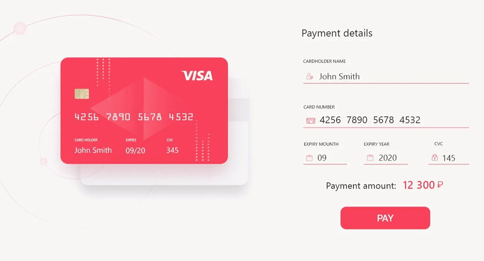
The checkout page is the make-or-break moment in the world of e-commerce. It’s the point where potential customers either complete their purchase or abandon their shopping cart. A well-optimized checkout page can significantly boost conversion rates and revenue, while a poorly designed one can lead to frustration and lost sales. This comprehensive guide delves into the essential strategies and techniques to optimize your checkout page, ensuring a seamless and compelling experience for your customers, from start to finish.
The first rule of optimizing your order summary page is to keep it as simple and streamlined as possible. Eliminate unnecessary steps, and only ask for essential information. The more complex and time-consuming the checkout process, the more likely customers are to abandon their carts.
Offer a guest checkout option. Many shoppers prefer not to create an account. By providing a guest checkout, you remove a significant barrier to completing the purchase. You can always encourage customers to create an account after the purchase is complete.
Ensure that the “Proceed to Checkout” or equivalent CTA button is prominent and easy to find. Use a contrasting color that draws attention and clearly states the action the user is taking. The CTA should be visible on both desktop and mobile devices.
Optimize your order summary page for mobile users. Mobile shopping is on the rise, and a mobile-unfriendly order summary page can deter potential customers. Test the mobile checkout experience thoroughly, ensuring that forms are easy to fill out, buttons are easily clickable, and the page loads quickly.
Provide multiple payment options to accommodate a broad range of customer preferences. This includes credit cards, digital wallets like PayPal and Apple Pay, and other payment gateways. Offering various payment methods enhances convenience and trust.
Display trust signals prominently on the order summary page. These can include security badges, SSL certificates, and any recognized payment logos. Communicate that customer data is secure, instilling confidence in your checkout process.
Include a progress indicator to show customers how many steps are left in the checkout process. Knowing where they are and how much more is ahead can reduce anxiety and encourage them to continue.
Be transparent about shipping options and costs. Unexpected shipping fees that only become apparent at the last stage of checkout can lead to cart abandonment. Provide clear information about shipping costs, delivery times, and available shipping options early in the process.
Make your return policy easily accessible from the order summary page. Shoppers feel more confident when they know they can return a product if it doesn’t meet their expectations. A transparent return policy can reduce hesitation at the checkout.
If applicable, allow customers to apply discounts or promotional codes directly on the order summary page. Make it easy for customers to find and use these codes. Additionally, you can provide incentives for first-time buyers, such as a one-time discount for creating an account.
Consider incorporating upsell and cross-sell opportunities during the checkout process. Suggest related or complementary products that customers may be interested in, but do so in a non-intrusive way that doesn’t disrupt the checkout flow.
Implement an abandoned cart recovery strategy. If a customer abandons their cart, send them a follow-up email reminding them about the items in their cart and offering assistance in completing the purchase. This can be a powerful tactic to recover potential sales.
Include social proof elements on the order summary page, such as customer reviews and ratings. Knowing that others have had positive experiences with your products can reassure potential buyers and encourage them to complete the purchase.
In conclusion, a well-optimized checkout page is a cornerstone of success. It’s where the rubber meets the road, and where visitors transition from browsers to buyers. By implementing the strategies outlined in this guide, you can create an order summary page that is user-friendly, trustworthy, and conversion-focused. A seamless and intuitive checkout experience will not only boost your conversion rates but also leave a lasting positive impression on your customers, increasing their likelihood of returning for future purchases.